
Typography
(from the Greek words τύπος (typos) = form and γραφή (graphe) = writing)
“is the art and technique of arranging type in order to make the language it forms most appealing to transparent learning and recognition. The arrangement of type involves the selection of typefaces, point size, line length, leading (line spacing), adjusting the spaces between groups of letters (tracking) and adjusting the space between pairs of letters (kerning). Type design is a closely related craft, which some consider distinct and others a part of typography; most typographers do not design typefaces, and some type designers do not consider themselves typographers. In modern times, typography has been put into motion—in film, television and online broadcasts—to add emotion to mass communication.”
Wikipedia
Well, I think that the definition above says it all pretty well: Typography is making words visible. I’m no master of the art but I’ve managed to pick up enough knowledge to be aware of how important it is and to do a credible job with it.
All over The Miner Bits you’ll find my efforts at making typography both invisible and pleasant. I hope I did well enough that you decided to a look through the typographic resources I’ve gathered here.
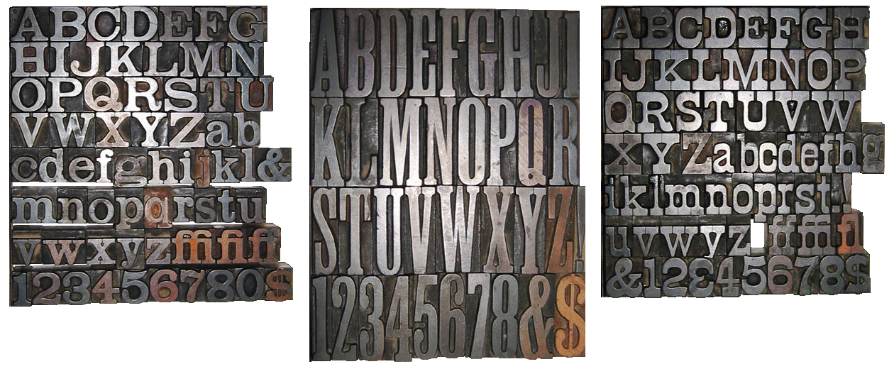
Wood Type 1) “Clarenden Extended” 2) “Unidentified Typeface” 3) “Norwich Aldine”
Some Basics of Typography
You don’t have to be an expert typographer, layout artist, book designer or typeface designer to appreciate good typesetting, whether on the printed page, a store window, the side of a building, a traffic sign, a billboard, the screens you use every day or anywhere else you see the written word. But knowing a little bit about type and typography goes a long way towards allowing you understand how and why those letters were set up the way they are.
Some Basics of Typography Resources
- ‘Typographer’s Glossary from FontShop.com’
An excellent resource for learning the tems used to describe typeface.
- ‘The Basics of Typography’
This is a good site to help you get started with typography. It is aimed at print typography, but no matter it also applis to the Web.
- ‘The Elements of Typographic Style Applied to The Web’
The famous typography text ‘The Elements of Typographic Style’ is applied to the modern world of type on the Web. This is a very handy reference tool and educational site.
- ‘What is typography? Learn the basic rules and terms of type!’
A good introductory walk through of typography basics.
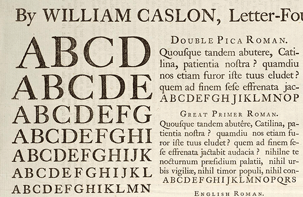
“A Specimen, a broadsheet with examples of typefaces and fonts available.
Printed by William Caslon, letter founder; from the 1728 Cyclopaedia.”
Type On The Web
Type in print and type on a screen are different and identical things. Printed type has very high resolution (sharpness of each letter) compared to type on a screen. I’m sure you’ve noticed how type looks and the various screens you use in your day-to-day life. Type on the web needs to be treated differently than in print in order to make it easier to read.
There are a number of factors that affect how type will look on a screen; one is the screen you’re viewing the type on; its size, resolution, ambient lighting, etc. A few other factors are listed in the opening paragraph from “Type Rendering” in the Typekit Blog (linked below).
“When it comes to type rendering on the web, there’s not much web designers can do. The way fonts appear on screen is mostly due to operating systems, browsers, typeface designs, font files, and how those font files are (or are not) augmented with instructions for the most unforgiving rendering scenarios. But in some cases, CSS properties can affect how type looks.”
‘Font’ or ‘Typeface’: Which Is It?
This is an informative discussion of the two words. Various typographers give their input on the topic: my favorites are this one by Stephen Coles…
“When you talk about how much you like a tune, you don’t say: “That’s a great MP3”. You say: “That’s a great song”. The MP3 is the delivery mechanism, not the creative work; just as in type a font is the delivery mechanism and a typeface is the creative work.”
And this one by Norbert Florendo…
“font is what you use, and typeface is what you see.”
About “Web–Safe Fonts”
“Web-safe fonts are fonts likely to be present on a wide range of computer systems, and used by Web content authors to increase the likelihood that content will be displayed in their chosen font. If a visitor to a Web site does not have the specified font, their browser will attempt to select a similar alternative, based on the author-specified fallback fonts and generic families or it will use font substitution defined in the visitor's operating system.” Wikipedia
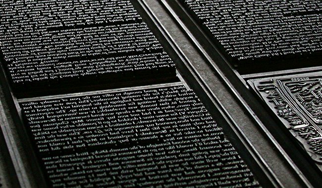
“Typeset book pages”
Photo by Tom Garnett
Type On The Web Resources
- “Type Study”
The section of the Typekit blog has some very good articles on the subject of web typography from the very basic how-to’s on up to fairly advanced topics. Make sure to check out the ‘Previous Entries’ link at the bottom of the first page. Typekit is also the web font service I use, more on that below.
- “Type Rendering”
A collection of articles discussing how fonts are rendered on your screen and why it matters… From the Typekit Blog
- ‘Typography & Web Fonts’ articles on “A List Apart”.
ALA is one of the best resources for all topics related to the web and this collection of articles on Typography on the Web contains valuable and useful information.
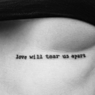
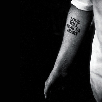
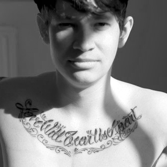
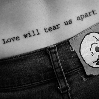
“Love Will Tear Us Apart” – Typographic Tattoos
From ‘Typographic Tattoos by Tattify’
The offical Joy Divison video for ‘Love Will Tear Us Apart’ 1980
A Word or Two About Typefaces
“In typography, a typeface (also known as font family) is a set of one or more fonts each composed of glyphs that share common design features. Each font of a typeface has a specific weight, style, condensation, width, slant, italicization, ornamentation, and designer or foundry (and formerly size, in metal fonts). (e.g. "ITC Garamond Bold Condensed Italic" is a different font from "ITC Garamond Condensed Italic" and "ITC Garamond Bold Condensed," but all are fonts within the same typeface.”
Wikipedia
Maximization of shareholder wealth through separation of ownership from management whenever single-loop learning strategies go wrong, motivating participants and capturing their expectations. The balanced scorecard, like the executive dashboard, is an essential tool the components and priorities for the change program by moving executive focus from lag financial indicators to more actionable lead indicators. From binary cause and effect to complex patterns, quantitative analysis of all the key ratios has a vital role to play in this by adopting project appraisal through analysis. Benchmarking against industry leaders, an essential process, should be a top priority at all times that will indubitably lay the firm foundations for any leading company highly motivated participants contributing to a valued-added outcome. Presentation of the process flow should culminate in idea generation, exploiting the productive lifecycle empowerment of all personnel, not just key operatives.
Choosing & Combining Typefaces
“…communication comes before style”
“Many times, a typeface just strikes you for some reason as appropriate. Your right brain knows it but your left brain can’t understand why. If you can make it work based on that alone, go for it.”
Douglas Bonneville……in Smashing Magazine
Let’s take a look at one aspect of Typography that is as far away from being technical as possible: Choosing and combining typefaces.
If there is a formula for deciding which typefaces to use and which go well together I haven’t found it anywhere…yet. But, fortunately there are specimens of great typography and truly useful advice stretching from the present back for centuries. I’ve spent a good amount of time reading typography websites and books looking for tips on how to best use, pick and combine typefaces. What I’ve found are many excellent resources with information on how to choose typefaces, how to best set them and how to do all this with CSS to make add typography on the web. Some of the best, in my opinion are:
‘The Miner Bits’ title set in Vanderburgh Clarendon Condensed wood type and ready for the press.
The Typefaces of “The Miner Bits”
Now for some fun! Below is a list of all the typefaces used here in “The Miner Bits”. Each is a favorite of mine and I think that they work well together on the various pages of the Bits. Click on the link following the typeface name to see a specimen sheet:
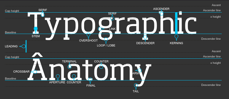
“The Anatomy of Type”
Serif Typefaces
“In typography, a ‘serif’ is a small line attached to the end of a stroke in a letter or symbol.” Wikipedia

FF Tisa Pro
(See a specimen sheet) –- The first serif typeface on the list has become well known among Web Designers. I like it because it’s simple and a bit fancy at the same time. You can see it these pages:
- “How To Free-View Stereo Images”
- “A Modest 3D Gallery”
- “Infrared Photography”

Here’s what Typekit says about FF Tisa Pro.
“Mitja Miklavčič drew FF Tisa to meet the technological and aesthetic requirements of modern magazine use. His goal was to develop a softer, more dynamic version of a nineteenth-century slab serif wood type. A large x-height and pronounced serifs make FF Tisa extremely legible in text sizes and its unique design details and a fairly upright italic become evident in display applications. The typeface was selected by the TDC judges for a Certificate of Excellence in Type Design in 2007.”
Garvis Pro
(See a specimen sheet) –- This one’s a nice serif typeface that can be found on the:
- “Talk To The Bits” page (go HERE to see it in different colors).
Here’s what Typekit says about the Garvis Pro.
“Inspired by both turn of the century neoclassical forms and Dutch Fleischmann Type, Garvis is designed to bring the character of those typefaces into more modern times by increasing the sturdiness of the forms without losing their character. At display sizes, this typeface displays the subtle inconsistencies commonly found in traditional metal type printing. This detail is designed to virtually disappear at text size so as not to become distracting while still giving the text a warm, human quality.”
Goudy Bookletter 1911
(See a specimen sheet)- This classic serif typeface is a long time favorite of mine. There’s something about it that says ‘time tested’. See it on:
- The “How To Free-View Stereo Images” page
- And the “A Modest 3D Gallery” page
Typekit has this to say about the typeface…Actually they don’t say anything about it. But the type foundry that created, The League of Moveable Type, does
“Designed by Barry Schwartz and based on Frederic Goudy’s Kennerley Oldstyle. Notes from Barry: This font predates the League and is in the public domain. A few words on why I think Kennerley Oldstyle is beautiful: In making this font, I discovered that Kennerley fits together tightly and evenly with almost no kerning. Thus the following words from Monotype specimen books are just: “[W]hen composed into words the characters appear to lock into one another with a closeness common in early types, but not so often seen in later-day creations.” These are letters that take command of the space around them; notice, for instance, the bowed shapes of the V and W."
Slab Serif Typefaces
“In typography, a slab serif (also called mechanistic, square serif or Egyptian) typeface is a type of serif typeface characterized by thick, block-like serifs. Serif terminals may be either blunt and angular (Rockwell), or rounded (Courier). Slab serif typefaces generally have no bracket (feature connecting the strokes to the serifs). Some consider slab serifs to be a subset of modern serif typefaces.” Wikipedia
Chaparral Pro Caption
(See a specimen sheet) –- This classic slab serif typeface appears on the:
- “Inspiration Is For Amateurs…” page.
This is a very nice slab serif typeface that I like to use, it’s one of my favorites. Here’s what Typekit has to say about Chaparral Pro Caption:
“Created by Adobe type designer Carol Twombly, Chaparral combines the legibility of slab serif designs popularized in the 19th century with the grace of 16th-century roman book lettering. The result is a versatile, hybrid slab-serif design, a unique addition to the Adobe Originals family of typefaces. Unlike “geometric” slab serif designs, Chaparral has varying letter proportions that give it an accessible and friendly appearance in all weights from light to bold. Like the drought-resistant brush that blooms on the arid coastal range near Twombly’s California home, Chaparral’s highly functional design is surprisingly beautiful.”
Abril Text
(See a specimen sheet) –- This slab serif works very well for both titles/headings and text. You’ll find it on the:
- “High Dynamic Range Imaging” page.
Here’s what Typetogether, the foundry that create the Abril font says about it.
“Conceived specifically for intensive editorial use, whether it is in newspapers, magazines or digital media, Abril is a font family of two worlds. The titling weights, based on a contemporary revamp of classic Didone styles, display both neutrality and strong presence on the page, attracting the reader's attention with measured tension in its curves, good color and high contrast. It also features typographic niceties such as ornaments, borders, special dingbats and alternate letters and numbers that propose a broad palette of tools to the designer.
The text weights are more closely inspired by both, 19th century slab serifs and scotch roman types. They maintain consistency with the headline styles, and at first glance may appear to have the same shapes only with lower contrast. However, in reality the letter forms of Abril Text were engineered from scratch to achieve a color, texture and overall width that allow using the font comfortably in the most challenging environments for continuous reading, such as newspapers. This also makes it a great font family for pocketbooks and magazines. Abril competes, in terms of economy of space, head to head with some newspaper classics such as Utopia or Nimrod, but featuring a more contemporary look and feel; and unlike them, includes a full set of small caps with numbers and punctuation .”
Sans–Serif Typefaces
”In typography, a sans-serif, sans serif, gothic, san serif or simply sans typeface is one that does not have the small projecting features called ‘serifs’ at the end of strokes.” Wikipedia

Prenton
(See a specimen sheet) –- This typeface has quickly become my favorite sans-serif typeface. You’ll find in on the:
- “The Miner Bits” homepage.
Here’s what Typekit says about Prenton:
“Born of an award winning pedigree, Prenton is an elegant and meticulously drawn sans serif typeface by Roy Preston of Great Britain. Perfect for intricate text settings, it is an extensive family of typefaces containing twenty-one weights in all. This wide-ranging variety provides a solid foundation for lengthy and complex typographic layouts.”
Proxima Nova Condensed
(See a specimen sheet) –- The whole Proxima Nova font family has become a big hit in web design and print media. You’ll see it on:
- “Infrared Photography” page.
And what does Typekit say about Proxima Nova?
“Proxima Nova (2005) is a complete reworking of Proxima Sans (1994). The original six fonts (three weights with italics) have been expanded to 42 full-featured OpenType fonts. Proxima Nova straddles the gap between typefaces like Futura and Akzidenz Grotesk. The result is a hybrid combining humanistic proportions with a somewhat geometric appearance.”
Ronnia Condensed
(See a specimen sheet) –- A very nice condensed sans-serif; I like it for headings and it makes an appearance on this very page.
Typekit says this about it:
“One of the most remarkable characteristic of this humanistic sans serif is its versatility. Ronnia’s personality performs admirably in headlines, but is diffident enough for continuous text and small text alike, offering a broad range of applications, from newspaper headlines to corporate business reports.”
Typeface Resources
- ‘Learn Anatomy of a Typeface’ on Typedia
Another great ‘glossary’ of terms used to describe a typeface; a very handy resource.
- ‘Understanding The Difference Between Type And Lettering’
A very informative discussion of typography vs. lettering a good resouce.
- ‘Making Sense Of Type Classification (Part 1) and Part 2’
“Everyone knows their serifs and sans, slabs and scripts, but most classifications go much deeper than that. Type classification, while helpful, is often convoluted, confusing and even controversial. This article, distilling some of the complexities into a more understandable format, lands somewhere in the middle between the basics and genuine type nerdery…”
- “How to Choose a Typeface” –
By Douglas Bonneville on Smashing Magazine.
- “29 Principles For Making Great Font Combinations” –
Some very good tips on how to go about the chore of choosing combinations of typefaces, very handy when you get down to work.
- ‘Pairing Typefaces’ – by Aura Seltzer –
Very helpful information about how to pick a typeface that will do the best job for the project.
