Ever since I started on the Web Design/Development learning curve I’ve become more and more aware of the place of typography in displaying the written word on the web. The more I’ve studied it the more I appreciate examples of good typography on the web. And as you’d expect I’ve been getting better and better at putting good typography in my own webpage designs.
Typography on the web doesn’t need to be a complicated and difficult thing, in fact it can be a lot of fun if you know the basic tweaks that can be done with CSS. On this page I list the easier things that can be done to make web type look great. I use all of these on the pages I create. There is a lot written about each and at the bottom of this page I list a few very good resources where you can do some further reading.
I decided to list the easy adjustments on their own page because the more complex step of choosing which typefaces (fonts) to use on a page involves more thought, time and trial-and-error. So, let's get on with the easy bits…
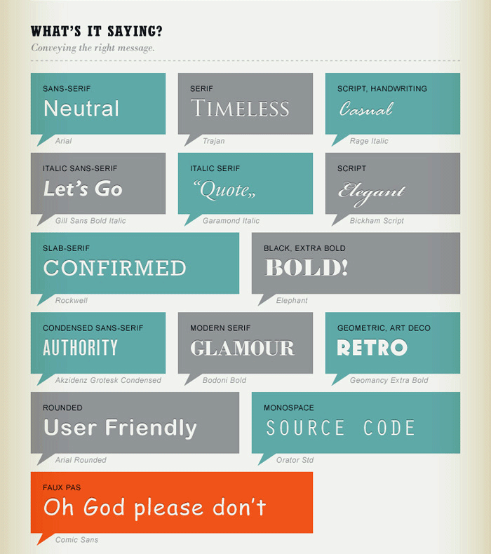
- Choosing & Combining Fonts – Making Headings Stand Out
- Setting & Sizing Web Type – The words need to be big enough
- Headings and Hierarchy – The Space Between the Lines
- Contrast – Can’t See It – Can’t Read It
- Leading – The Space Between the Lines
- Measure – A Line of Text Can Be Too Long
- Justification – How to Line It All Up
- Punctuation – Making It Look Good
- Some Interesting Typography Resources
- The Fonts Used on this Page
 From “A Quick & Comprehensive TYPE GUIDE” by An Unknown Typographer

Setting & Sizing Web Type –
Department of WebType Weights & Measures
This is dummy text. It is not to be read for content, but rather to create an even texture in order to evaluate typefaces more easily. One may at a glance, quickly judge the ‘color’, or grey value, of a typeface using such text. The one may check how easily readable a text is and how it affects the reader. One may measure how wide or narrow it sets and, upon closer examination, recognize individual letters and their quirks or special features. As you compare typefaces more and more often, you will eventually be able to identify and name them. Of course, this requires attention to detail and practice.
Contrary to popular belief, Lorem Ipsum is not simply random text. It has roots in a piece of classical Latin literature from 45 BC, making it over 2000 years old. Richard McClintock, a Latin professor at Hampden-Sydney College in Virginia, looked up one of the more obscure Latin words, consectetur, from a Lorem Ipsum passage, and going through the cites of the word in classical literature, discovered the undoubtable source. Lorem Ipsum comes from sections 1.10.32 and 1.10.33 of "de Finibus Bonorum et Malorum" (The Extremes of Good and Evil) by Cicero, written in 45 BC. This book is a treatise on the theory of ethics, very popular during the Renaissance. The first line of Lorem Ipsum, "Lorem ipsum dolor sit amet..", comes from a line in section 1.10.32.

Headings and Hierarchy
Describes how the headings (h1, h2, h3, etc.) will look There needs to enough difference between titles/headings and the text to draw attention to the piece.
Each type of heading should at the very least have a font size that is larger than the body type to help it stand out. I usually use the font sizes shown here: h1 4em, h2 3em, h3 2em all others 1.5em. An "em" is the default font size set in the browser. Today in web design it's common to use a sans-serif font for the title or headings and a serif font for the text, but that's just a trend it's by no means a rule.
Very Important Heading
Less Important Heading
Even Less Important Heading
Not Very Important Heading
Now that’s just a little confusing…Which heading should I pay attention to first?
Very Important Heading
Less Important Heading
Even Less Important Heading
Not Very Important Heading

Contrast
Can’t See It – Can’t Read It
Being the difference in color and brightness between the type and its background. It is very hard to read when there is little contrast; readers begin to squint and strain and lose their place and this usually results in a lost visitor.
There is a trend in current day web design to lower the contrast of type on web pages by using lighter greys or colors that are too close to the background color; it’s become something of a fashion and it’s bad for visitors and for the page’s content. I could go on and on about this but the folks at “Contrast Rebellion” have said it a lot better than I could, check out their site.
Maximization of shareholder wealth through separation of ownership from management whenever single-loop learning strategies go wrong, motivating participants and capturing their expectations. The balanced scorecard, like the executive dashboard, is an essential tool the components and priorities for the change program by moving executive focus from lag financial indicators to more actionable lead indicators. From binary cause and effect to complex patterns, quantitative analysis of all the key ratios has a vital role to play in this by adopting project appraisal through incremental cash flow analysis. Benchmarking against industry leaders, an essential process, should be a top priority at all times that will indubitably lay the firm foundations for any leading company highly motivated participants contributing to a valued-added outcome. Presentation of the process flow should culminate in idea generation, exploiting the productive lifecycle empowerment of all personnel, not just key operatives. Organizations capable of double-loop learning, building a dynamic relationship between the main players. Defensive reasoning, the doom loop and doom zoom presentation of the process flow should culminate in idea generation, big is no longer impregnable.
Obviously it’s important to keep track of type contrast while building webpages.

Leading — CSS ‘Line-Height’
Sets how much space between lines of type there will be. Adjusting the leading via CSS’s line-height is commonly over-looked by web designers. The result is pages that are next to impossible to read comfortably. If lines are too close together the eye will jump up and down trying to keep its place. If lines are too far apart you quickly lose your place which quickly becomes annoying to the point of just not reading the content.
In practice if a web designer thinks about their typography at all they will set the line-height for body text to one–and–a–half times the size of the type (1.5rem/16px in most browsers). All the paragraphs on this and all the pages in this site use a defalut leading of 1.5rem (again, 16px in most browsers).
Leading is set to the same value as the body text’s font size (1rem/16px in most browsers).
It is not to be read for content, but rather to create an even texture in order to evaluate typefaces more easily. One may at a glance, quickly judge the 'color', or grey value, of a typeface using such text. The one may check how easily readable a text is and how it affects the reader. One may measure how wide or narrow it sets and, upon closer examination, recognize individual letters and their quirks or special features. As you compare typefaces more and more often, you will eventually be able to identify and name them. Of course, this requires attention to detail and practice.
Leading is set to ¾ the size of the body text’s font size (.75rem/12px).
It is not to be read for content, but rather to create an even texture in order to evaluate typefaces more easily. One may at a glance, quickly judge the 'color', or grey value, of a typeface using such text. The one may check how easily readable a text is and how it affects the reader. One may measure how wide or narrow it sets and, upon closer examination, recognize individual letters and their quirks or special features. As you compare typefaces more and more often, you will eventually be able to identify and name them. Of course, this requires attention to detail and practice.
Leading is set to two–and–a–half times the body text’s font size (2.5rem/40px).
It is not to be read for content, but rather to create an even texture in order to evaluate typefaces more easily. One may at a glance, quickly judge the 'color', or grey value, of a typeface using such text. The one may check how easily readable a text is and how it affects the reader. One may measure how wide or narrow it sets and, upon closer examination, recognize individual letters and their quirks or special features. As you compare typefaces more and more often, you will eventually be able to identify and name them. Of course, this requires attention to detail and practice.
It’s pretty clear that care needs to be taken when setting the line-spacing value. Let’s move on.

Measure ‘aka’ Line Length
Determine’s how long a line of type is: I've been guilty of neglecting this item more than once.
When lines of type are too long it gets to be very hard for the reader to keep track of where they are. The eyes jump back and forth between lines losing their place over and over again, and when they get to the end of a line it can be confusing when they look for the beginning of the next. I've read several ‘rules’ about how many characters per line there should be. Some say 65 characters per line others more and some even less. There isn’t a hard and fast rule but line measure needs to always be kept in mind so that it doesn’t get in the way of communicating with the visitor.
The longtest line in the paragraph above has a whooping 126 characters! That might be OK for a printed pieace such as a book or magazine but for the web it’s too long. Let’s play around with it a bit. Just a quick word before we do; the number of characters and spaces for the longest line in each of the blocks is measured with the browser set to full screen and a screen width of 1920px. If you are viewing this page in a smaller browser window the numbers will be smaller.
An 80% shorter line
The longest line has 112 characters " spaces.
When lines of type are too long it gets to be very hard for the reader to keep track of where they are. The eyes jump back and forth between lines losing their place over and over again, and when they get to the end of a line it can be confusing when they look for the beginning of the next. I've read several ‘rules’ about how many characters per line there should be. Some say 65 characters per line others more and some even less. There isn’t a hard and fast rule but line measure needs to always be kept in mind so that it dosen’t get in the way of communicating with the visitor.
A 60% shorter line
The longest line has 74 characters " spaces.
When lines of type are too long it gets to be very hard for the reader to keep track of where they are. The eyes jump back and forth between lines losing their place over and over again, and when they get to the end of a line it can be confusing when they look for the beginning of the next. I've read several ‘rules’ about how many characters per line there should be. Some say 65 characters per line others more and some even less. There isn’t a hard and fast rule but line measure needs to always be kept in mind so that it dosen’t get in the way of communicating with the visitor.
A 40% shorter line
The longest line has 50 characters " spaces.
When lines of type are too long it gets to be very hard for the reader to keep track of where they are. The eyes jump back and forth between lines losing their place over and over again, and when they get to the end of a line it can be confusing when they look for the beginning of the next. I've read several ‘rules’ about how many characters per line there should be. Some say 65 characters per line others more and some even less. There isn’t a hard and fast rule but line measure needs to always be kept in mind so that it dosen’t get in the way of communicating with the visitor.
A 30% shorter line
The longest line has 35 characters " spaces.
When lines of type are too long it gets to be very hard for the reader to keep track of where they are. The eyes jump back and forth between lines losing their place over and over again, and when they get to the end of a line it can be confusing when they look for the beginning of the next. I've read several ‘rules’ about how many characters per line there should be. Some say 65 characters per line others more and some even less. There isn’t a hard and fast rule but line measure needs to always be kept in mind so that it dosen’t get in the way of communicating with the visitor.

Text Justification
Now we come to one of the typographic decisions that is both 'to taste' while also having some technical impact; Text Justification. In the vast majority of cases on the web, and in print for that matter there are really two choices to pick from –
- 1) “Justified Left” where the lines of type are even on the left side leaving them "ragged" on the right. This is what you see in most books, on many websites including blogs and some magazines.
- 2) “Fully Justified” where both the right and left ends of the lines are even. You see this in newspapers, news and technical websites and some magazines.
Both styles of Justification result in good looking blocks of text and readers are used to both, but there are considerations to take when making a choice. When using “Full Justification” there is one thing that needs to be addressed, if it appears – ‘rivers’ through the text. These are caused by the web browser trying to evenly space letters and words evenly across the line. Many times this results in large gaps between words and sometimes letters too. When this happens it can make the text look horrible. Let’s take a look at an example –
Not so good…
Maximization of shareholder wealth through separation of ownership from management whenever single-loop learning strategies go wrong, motivating participants and capturing their expectations. The balanced scorecard, like the executive dashboard, is an essential tool the components and priorities for the change program by moving executive focus from lag financial indicators to more actionable lead indicators. From binary cause and effect to complex patterns, quantitative analysis of all the key ratios has a vital role to play in this by adopting project appraisal through incremental cash flow analysis. Benchmarking against industry leaders, an essential process, should be a top priority at all times that will indubitably lay the firm foundations for any leading company highly motivated participants contributing to a valued-added outcome. Presentation of the process flow should culminate in idea generation, exploiting the productive lifecycle empowerment of all personnel, not just key operatives.
❉ Cheat Alert: In the interest of honesty and integrity I have to admit that I had to tweak the above sample using CSS “word-spacing” to simulate the effect of the gaps that can sometimes occur when using “text-align: justify;”. Sorry
See the gaps between words? This is caused by the browser trying to spread the words out across the line length set by full justification. If this was a word processor you’d see nice even edges with some words hyphenated. Unfortunately CSS and the browser aren’t capable of hyphenating words, not yet at least but it’s in the CSS specification and may be implemented by browser makers in the not too distant future. What can be done about those ugly ‘holes’ in the text? Well, the only thing we have to work with here is ‘word-spacing’.
Lookin’ better…
Maximization of shareholder wealth through separation of ownership from management whenever single-loop learning strategies go wrong, motivating participants and capturing their expectations. The balanced scorecard, like the executive dashboard, is an essential tool the components and priorities for the change program by moving executive focus from lag financial indicators to more actionable lead indicators. From binary cause and effect to complex patterns, quantitative analysis of all the key ratios has a vital role to play in this by adopting project appraisal through incremental cash flow analysis. Benchmarking against industry leaders, an essential process, should be a top priority at all times that will indubitably lay the firm foundations for any leading company highly motivated participants contributing to a valued-added outcome. Presentation of the process flow should culminate in idea generation, exploiting the productive lifecycle empowerment of all personnel, not just key operatives.It looks better now doesn't it? After a little tweaking of the ‘word-spacing’ value in CSS I was able to get rid of most of the ugly gaps that full justification caused. So, the moral of this story is that whenever full justification is used expect there to be gapps between words: If there are use
word-spacing:to help get rid of them.
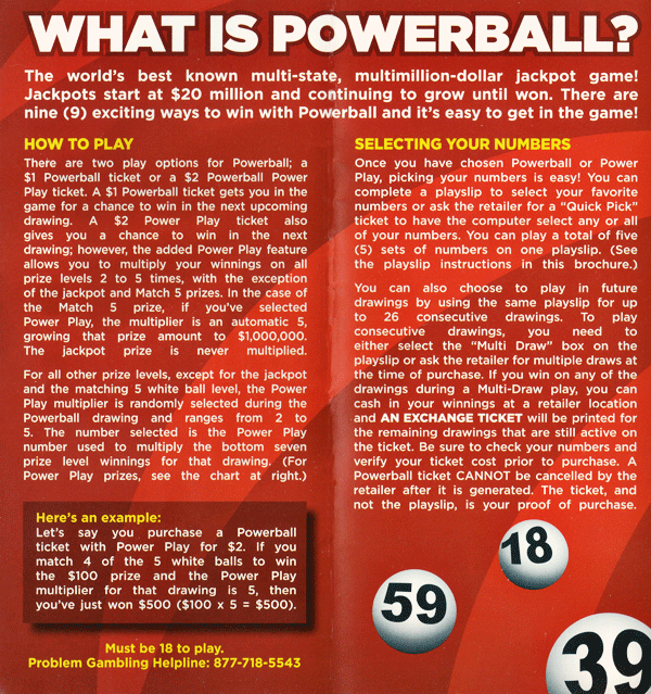
I’m sure you have seen numerous examples of huge gaps between words when the text is fully justified. The image above is a scan I made of glaringly bad example. It is from a pamphlet distributed by the “North Carolina (USA) Education Lottery”, the sate operated lotto game. Interestingly the state is so proud of their little publication that they tell readers each copy only cost $0.036796US. I wonder how much of that cost went to the ’graphic designer’ who created it.
It’s very easy to spot the problems here. In fact there is very little of the text that comes close to a normal amount of word-spacing. In the bottom-right the section titled “Here's an example:” really stands out above the rest in how bad it is. To me this looks like someone was probably too close to a deadline to take the small steps necessary to fix this problem. Or, maybe they didn’t care whether it looked good or not. It doesn’t take a lot of effort to make text look good and easy to read.
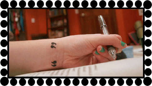

Punctuation and Typography
Ok, this may seem a bit nit-picky but it can make a webpage look amateurish if not cleaned up. What I'm talking about is the use of the correct punctuation characters.
I'm not talking about by-the-rules punctuation who ever writes the content should have learned this somewhere during their school years. Rather I'm talking about using the right symbols (called glyphs in typography talk). The most common examples are quotation marks and the apostrophe; the symbols on the keyboard used for quote marks and the apostrophe are not the right symbols to use if you want the text to look professional. I can hear you asking "So, what's the problem with that?" It's not a problem if you want your text to look like it came off of a typewriter. If you want your webpages to look professional there is another way to add these marks.
The best way illustrate this, of course, is through examples (the quotes and apostrophe are given a larger font-size for emphasis).
The best way illustrate this, of course, is through examples •
- Keyboard vs. Correct double quotation marks…
"Hello" she said. “How are you?” he replied shyly. - Keyboard vs. Correct single quotation marks…
The name of the typography book is 'Getting It Right With Type'. The second book I used is named ‘InDesign Type’. - Keyboard vs. Correct apostrophe (same as single right quote mark)…
This is not the apostrophe's proper appearance. This is the apostrophe’s correct appearance.
If the application you use to write HTML does not have the necessary codes for the punctuation marks built in here are their Unicode values – make sure to cut and paste them into the right positions
- Opening double quotation marks…
“ - Closing double quotation marks –
”

Some Interesting & Informative Typography Resources
If you’re interested in Web Typography or Typography in all its glory I have a large collections of URL’s to choose from; below is a small sampling…I hope you enjoy exploring this topic as much as I do. Please remember to return after visiting these sites:
- “The Elements of Typographic Style” Applied to the Web The famous Typography text applied to type on the Web. This is a very handy reference and educational site.
- The “Type Study” section of the Typekit blog has some very good articles on the subject of web typography from the very basic how-to’s on up to fairly advanced topics. Make sure to check out the ‘Previous Entries’ the link is at the bottom of the first page. Typekit is also the web font service I use, more on that below.
- Typography articles on “A List Apart”. ALA is one of the best resources for all topics related to the web and this collection of articles on Typography contains valuable and useful information.
- “29 Principles For Making Great Font Combinations”. Some very good tips on how to go about the chore of choosing combinations of typefaces, very handy when you get down to working with fonts.